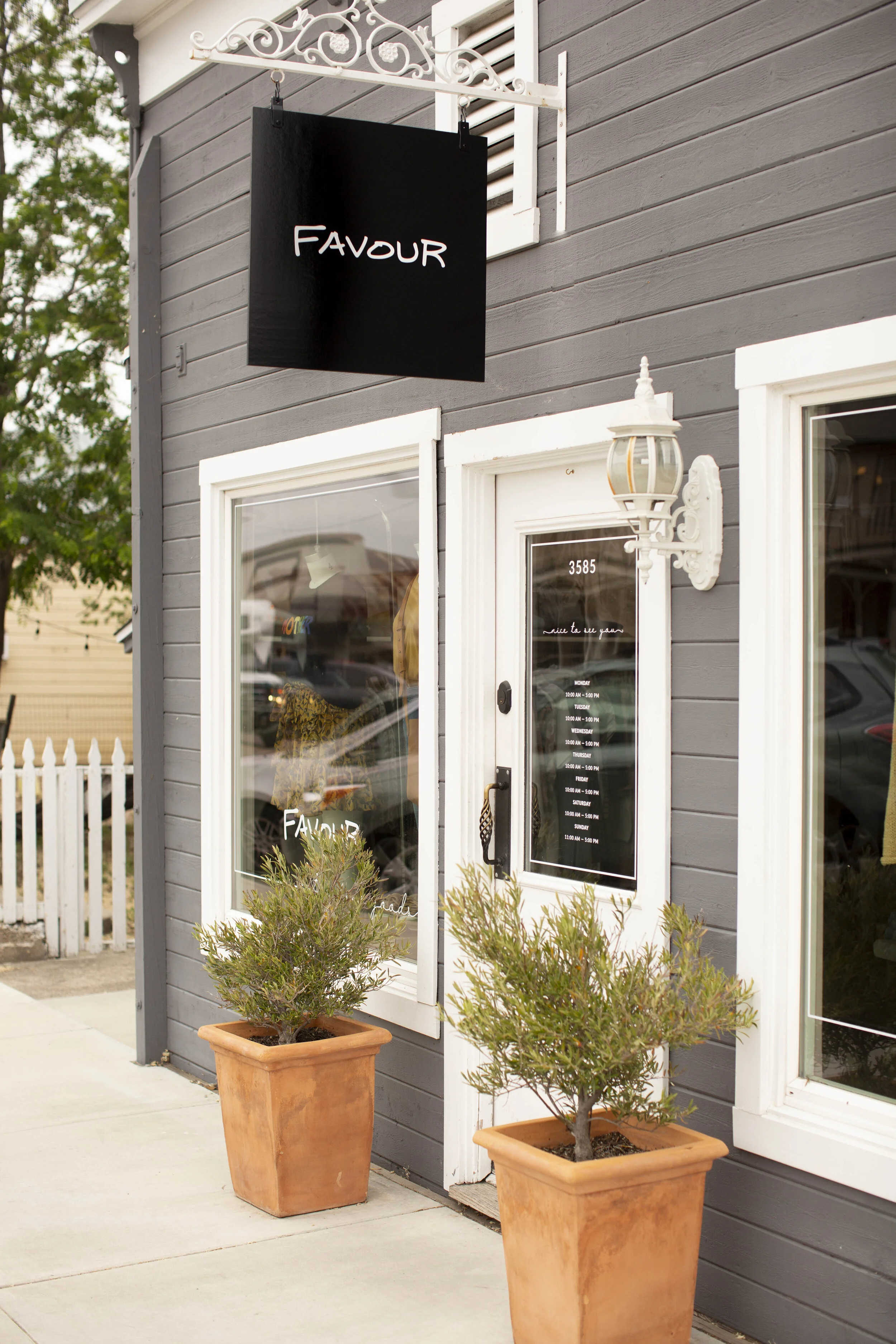
FAVOUR
FAVOUR originally opened under the name Ladybug Boutique in 1998 as a brick and mortar store. In 2019 the current owner decided to re-brand in order to bring the store in line with it’s current values: femininity, attention to detail, refinement, and the belief that great basics can take you anywhere.
Services
Branding
Logo Design
collateral design
Signage + Windows


Goals:
create an elevated and feminine Brand for Favour
Lindsay Branquinho had a specific vision for her new brand. We would use her father’s distinct handwriting and his surname as the boutique’s name.
Brass Eyed Buffalo had the task of retaining the caliber of quality found within the store in the branding. Handwritten logotypes can often come across as whimsical, and we were aiming for elevated. We drew inspiration from Parisian storefronts and aimed for a clean and feminine vibe. Finding the perfect script for the tagline was paramount. We also uncovered the perfect vintage engraving to accent Lindsay’s family brand and horseshoes as brand assets.
Strategy:
adapt handwriting to make main logotype and Pair with the perfect script.
Balance the handwritten logotype with a sleek and refined type system.
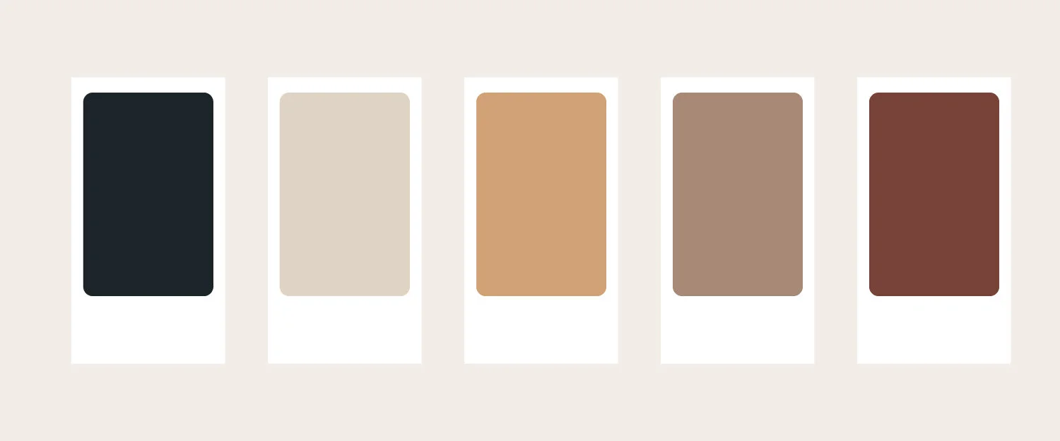
create a color palette that was versatile and complimentary of the brand’s new identity.
design collateral such as business cards and thank you cards